Your cart is currently empty!
Free Shipping on all orders over $75!
Plum Paper Planner Review
By
.
Every year, it seem I ask myself the same question: What planner should I use?!
I spend weeks (sometimes even months) trying to find my answer. And even when I think I’ve found it, I usually spend the better part of the first year refining my planner. It’s okay, you can laugh at me. I realize this is not normal, haha.
In the past, I’ve made moleskine notebook planners (see my 2012 planner, and my 2013 one too). I’ve also tried Erin Condren’s life planners and, while I wasn’t as big of a fan of the daily layout, they’re still nice planners.
For most of 2013, I ended up putting my moleskine aside – after all that work!!! – in favor of a Plum Paper Family Planner. I got it mid-year, so it ran 2013-2014.

One of my friends introduced me to Plum Paper Designs back in the spring and as soon as I saw the family planner and that you could customize the tabs I knew I had to have one. It seemed like the perfect solution for keeping every thing I organize in my moleskine notebook together on one weekly page.
With the family planner, you can specify six sections. I went with – personal, family, study, shop, blog, budget and meals.
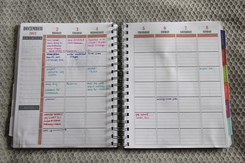
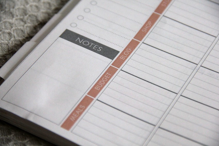
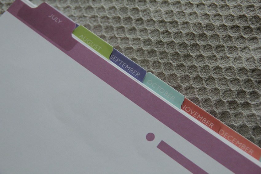
Since I bought the planner in July, it runs July 2013-June 2014. So, I technically have a planner until mid-2014 but… you know me… I may not be able to stick with the planner for that long.
But I do really enjoy it!
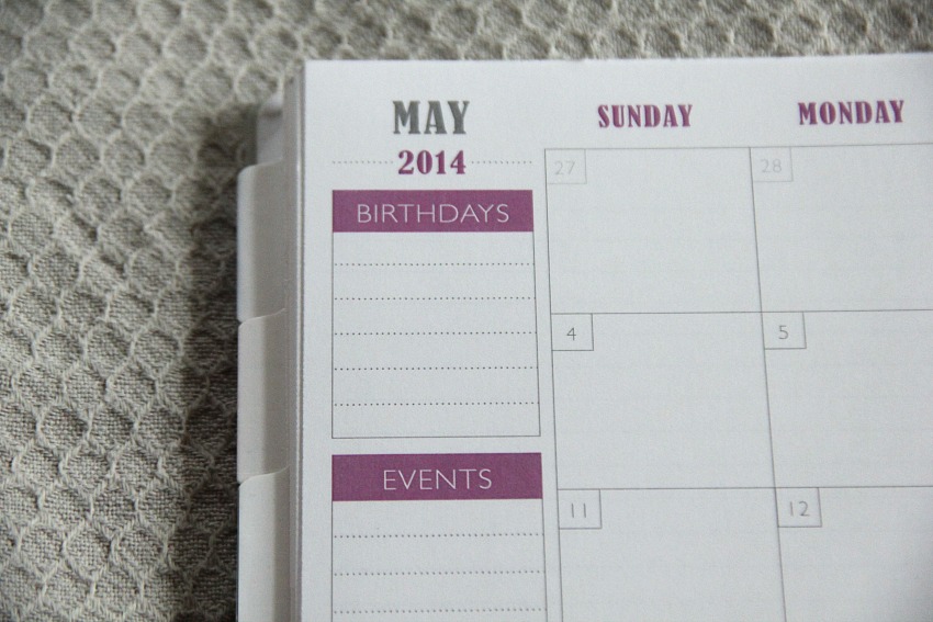
The months are setup pretty simply. There are sections on the left side of the page for birthdays and events. I usually don’t use those for what they’re labeled for, because I put birthdays and events in the box for whatever particular day they are happening. So, instead, those sections contain goals or a main idea/word I’m focusing on for that month. There’s also a notes box which I use for…….. notes!
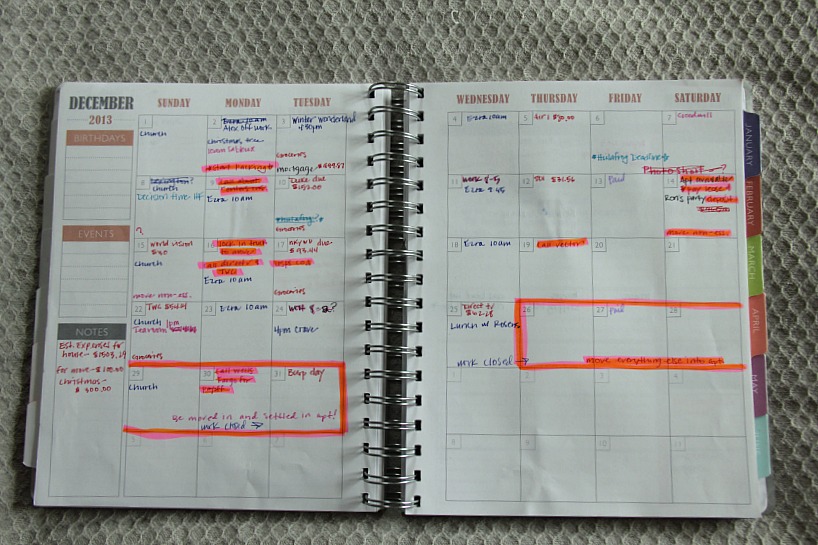
The month above – December 2013 – is crazy looking, I know. I was still working on my color coding that I wanted (you can see what I settled on in the weekly view picture above) plus the highlighter was to mark out when we were moving out of our first house and closing on the sale of that house, too. That was a crazy time.
So, with all that said, what are my favorite features of the Plum Paper Planner? Well, I’m glad you asked. They are (in no particular order):
- The paper. Oh my goodness, the paper! It’s a decent thickness, and is so smooth. There is minimal shadowing with pens and highlighters. For a coil-bound planner, I find this impressive because many coiled planners tend to have thin paper to accommodate for, well, the coil.
- Speaking of the coil, it’s nice and thick. I like that it’s a double coil. No bending, and no snagging.
- The boxes for the monthly layout are nice and big.
- I like that there are lines on the weekly spread. I tend to write slanted when there are no lines.
- The tabs are laminated.
- The option for customization on the family planner. The options are endless here, folks.
Things that are not my favorite about the Plum Paper Planner –
- The cover page is just thick cardstock. There is a plastic transparent cover over it, but even so. I think a laminated cover, like what the Erin Condren Life Planner offers, would be nice.
- Color schemes. This is entirely a personal preference thing, but I’ve come to realize that color schemes are not for me. I prefer a black and white planner. But a lot of people are the total opposite, and having color schemes for each month will not bother them.
I think for the price point, the two things that I don’t particularly enjoy about the Plum Paper Planner can be easily overlooked. You can’t argue with the fact that it’s an affordable planner, especially when you consider all the features that are packed inside.
Have you ever tried Plum Paper? If so, what did you think? Thanks for reading 🙂
2 responses to “Plum Paper Planner Review”
[…] had the tab open for a few days after I shared my 2014 planner and was finally ready to commit, and when I refreshed the page the planners were totally sold out. […]
[…] 2013 Moleskine Planner 2013-2014 Plum Paper Planner […]

Leave a Reply