Your cart is currently empty!
Free Shipping on all orders over $75!
A To Do List for the Playroom
By
.

The main reason we chose the Davidson floorplan for our Drees home was because of the play room.
Oddly enough, this is the space I kind of dislike the most about our house. But it’s only because I have no idea what to do with it. It’s a big room, which makes it a little overwhelming.
So this post is all about a few ideas I have for how to set this room up. Here’s how it looks today –
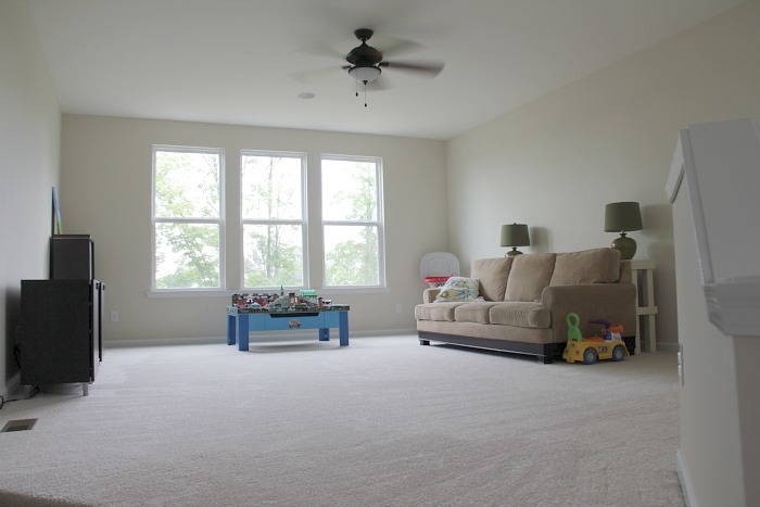
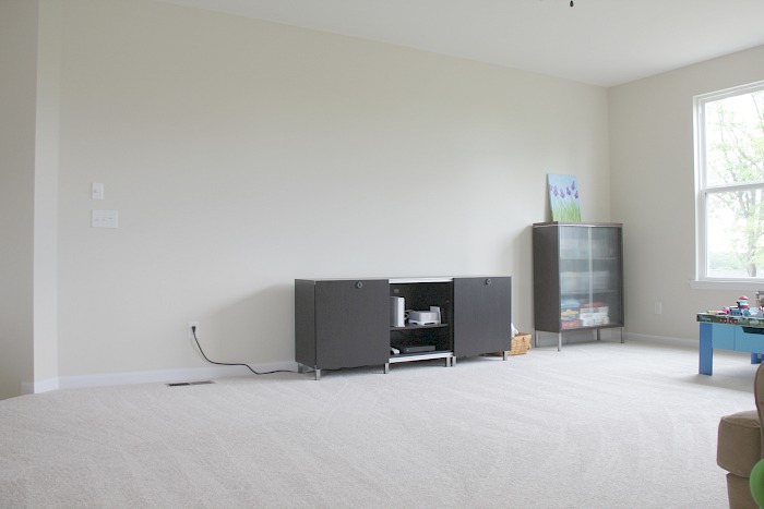
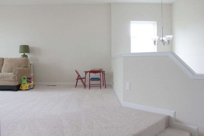
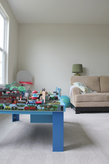
So, pretty much a blank slate, huh? As you can tell, this room kind of became the catch-all for the furniture from our old house that didn’t really have a place in this new house. To give an idea of the space, it’s 17′ x 21.5′ (length) – large and just a little awkward due to the half wall by the stairs and the wall of windows. There are really only two usable walls where you can put things, and one is cut short by being right by the entry.
One of the first things I would love to do this in this room is add window treatments – especially because the sun sets at the back of our house, so this room heats up fast in the late afternoon/early evening – paint the walls and maybe add some kind of decorative trim. So, here are a few ideas I’ve got swirling in my head as to what that might look like.
Back when we went under contract, I created a paint colors board on Pinterest and added a bunch of palettes that caught my eye. The tricky thing with painting the playroom is it eventually shares walls with basically the entire first floor of the house and the hallway upstairs – because the couch wall technically goes all the way over to the stairwell, which goes downstairs and leads to the wall with the television on it, which goes to the fireplace, and so on. I’m not against accent walls (and if I was going to do an accent wall in the playroom, I would make it either the wall where the couch currently is, or the wall with the windows) but regardless, I want a whole-room color that’s neutral enough that I wouldn’t mind seeing it throughout the entire house.


Both of the above palettes are from Design Seeds and for some reason, the Pinterest link doesn’t take me directly to the original page where it was pinned from. But if you need some paint palette inspiration, definitely visit that site.
Our kitchen and living room have a bit of a purpley undertone to them because of the granite – which has large splotches of very dark purple in it. So that’s why I’m kind of being drawn to navy and dark plum for accent colors. The color I would slap on the walls? In the first palette option, I would put the very bottom grey (but probably two shades – at least – lighter). And the second palette, I would put the top color on the walls. Now that I’m looking at these stacked up together, I think the second shade of grey in the bottom picture is the same shade of grey in the top one?
The purples and navy tones would come in through pillows and decorative accents.
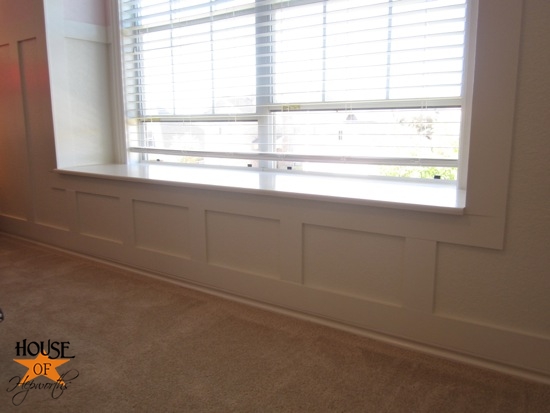
Keeping this in mind, though, a friend of mine planted the idea of doing a board and batten treatment around the room. I love that idea, but because of the room’s openness, I’m not entirely sure how it would look – unless we only did it on the wall with the windows? If we did it in the whole room, I feel like it would also have to go in the upstairs hallway, then down the stairs as well.
Something like that would be really cool and fairly doable on just one wall. Take a look at the wall of windows again –

I could easily see doing the whole window wall in a board and batten style treatment, and keeping it simple with some white shades.
I’m also still brainstorming on what I want to do in terms of furniture placement. I’m debating painting the existing TV stand (because there’s nothing wrong with it and it’s great for toy storage), as well as the table behind the couch both a dark navy or purple. I would love to swap out the couch for a sectional, but I am a little concerned that might eat up a lot of play space.
But mostly what the room needs is toy storage. What you can’t see from the pictures is in the corner where the basketball hoop is a plastic bin full of miscellaneous toys that won’t fit in the TV stand. It really becomes a mess in that corner as the week goes on and things get played with, then tossed back in the bin haphazardly.
So, with all of this in mind, here’s my To Do list for the Playroom –
- Paint the walls, upstairs hallway and stairwell some light shade of grey (with the eventual plan being to also paint the living room, kitchen, eat-in area the same shade of grey)
- Add a board & batten treatment to the window wall
- Add some simple white 2″ faux wood shades to the three windows
- Paint the TV stand – not sure on the color yet
- Paint the accent table – not sure on the color yet
- Better lighting; relocate table lamps elsewhere
- Toy storage solution
- Better/more seating
I would love to hear any ideas you might have for this space! Thanks for reading 🙂
3 responses to “A To Do List for the Playroom”
Hi there. I love your blog – everything about it. And how amazing to find out about your Drees experience. We are building with Drees too, and we are going to see our granite this week. i don’t think I like what I picked at the design center – and how coincidental that our dining room and baby’s room have lavender and purple tones. Can I ask which granite you went with? This page mentions “large splotches of purple” . I want that!!
Hello! Congratulations on your home – how exciting! We had originally chosen Giallo Ornamentale at the design center, but I was afraid everything in the kitchen/living room area would be so *brown*. When we went to pick our slab, we spied some granite called Ashen Grey that was a Level 1, so we had no upcharge for changing the selection. It has splotches of purple (sometimes they look dark brown, but I think they’re just a very dark purple), grey, taupe, white… it’s got a very cool look to it. You can see some pictures of it here – https://charminglymodern.com/modern-kitchen-living-room-combo/
[…] upstairs playroom and how it’s pretty much a blank state (you can find the post here – A to do list for the playroom). Now that we are expecting baby #2, I’ve started to revisit the idea of the playroom, and […]

Leave a Reply