Before I share the rest of our house progress, I wanted to show you the selections we picked for the inside of our home (if you missed our exterior selections, click here >> Moodboard: Exterior Selections). This entry is just about the kitchen selections.
We didn’t upgrade very much in the way of inside stuff. We walked out of the Design Center adding only $620 to the purchase price of our home – part of that was an upgraded faucet (we went from a chrome finish to a brushed nickel one for the kitchen faucet) and the rest was overage from upgrading the flooring on the main level to all hardwood (of which the actual cost was around $2,000 additional but we had built in a cabinet allowance of $1,600 that we ended up not using so that covered the bulk of the hardwood upgrade).
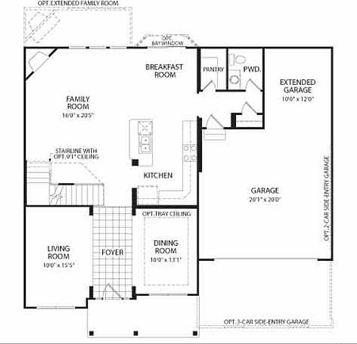
Most of the selections revolve around the kitchen. On the main level, our floor plan revolves around the kitchen and living room area so we paid a lot of attention to the kitchen since it will sort of set the tone for the main floor. Check out the floor plan to get an idea of what I mean –
Main Floor
Second Floor
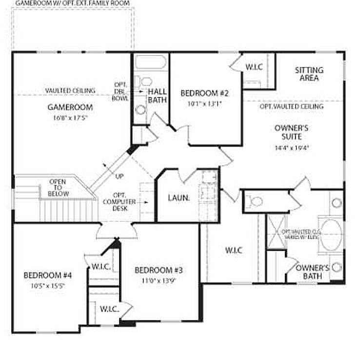
Sorry for the quality of these images, but despite the way the text looks I think you get the idea. We did the optional extended family room/game room (it also extends the basement) and the bay window. The family room extension added 4′ to that area (and the upstairs/basement as well) and the bay window added 3′ to the kitchen. So, it’s a pretty open space we were dealing with and we tried to keep that in mind with what we chose.
Initially, I was thinking all white – white cabinetry, white trim, white walls, WHITE! I wanted something very open and airy. But the more I looked at white kitchens, the less I started liking them. Which shocked me. I mean, I love white accents, white furniture, white anything and everything. But… the final nail in the coffin was seeing a white kitchen in person, at the design center. It just did nothing for me.
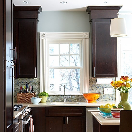
I kind of suspected that might happen, so I had started gathering inspiration images of kitchens with dark cabinetry. Here’s a couple of them –
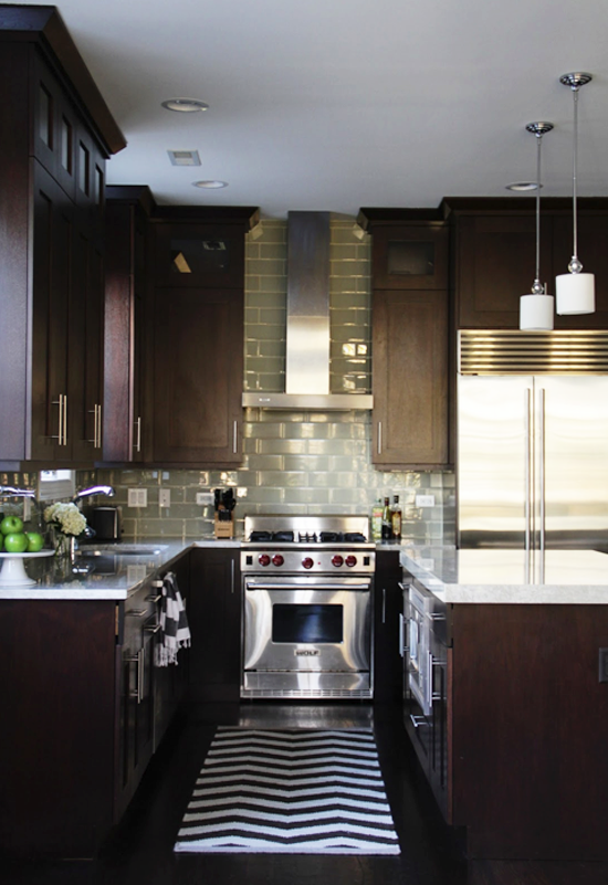
Via Adventures in Dressmaking
(I don’t think this is her original image, so if you know whose it is please comment! Pinterest strikes again.)
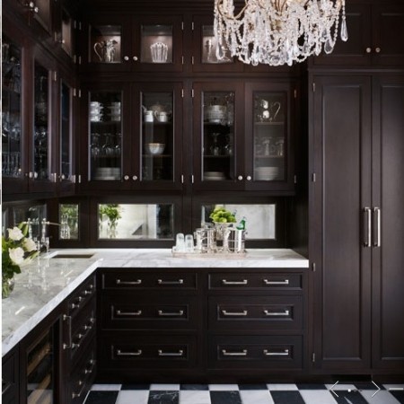
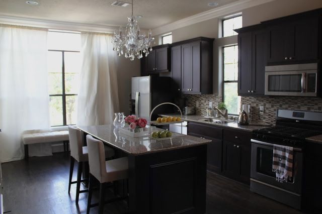
Again, I was very surprised that I started leaning in this direction because traditionally I really shy away from dark interiors. There was just something about the dark cabinetry, the dark floors and a pop of brightness on the countertops that drew me in. So, we went with it. This is what we chose –
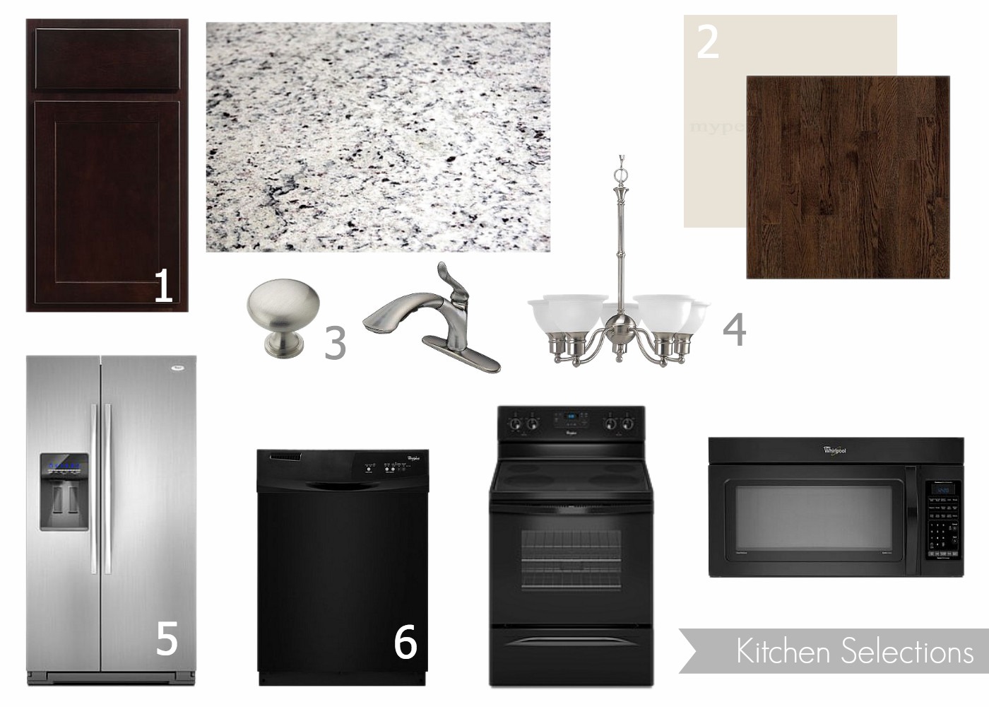
1 – Cabinetry. As I mentioned, we had built in an allowance in our contract price in case we wanted to upgrade our cabinets. We chose not to. Upgrading your cabinets meant that the face changed – some had more dimension, others were flat. Mostly, though, we wanted the option for the upgrade in the event that white cabinetry was not a base option (it wasn’t, by the way). That ended up not mattering, though, when we saw the color options at the base level and, plus, we ended up deciding against white cabinetry anyway. These cabinets are Merillat birch in the “Twilight” finish and they are gorgeous in person. Can’t wait to share photos of them!
Granite. I also have mentioned how we originally wanted corian countertops but ended up going with granite. When we went under contract, we selection granite countertops with the intention of swapping them out for corian once we got to the Design Center. However… corian ended up being more than the allotted upgrade amount (which was $4,500 if you’re curious) so we decided to stick with granite. We initially chose Giallo Ornamentale, which is a nice, neutral granite. But, it was also what we had in our old house (in the bathroom) and I didn’t really want to have what we already have. Plus, I was worried the room would be so brown. A few weeks ago we paid a visit to the granite supplier and were able to chose our own slab. We had the option to change to any granite (or any stone surface, really… they had quartz, marble, etc. But if you went above a Level 1 – aka base level – you paid an upgrade cost plus a change order fee) and luckily we found a gorgeous, light colored granite at Level 1. No upgrade charges! The granite we chose is called “Ashen White” and is perfect for the space. It has flecks of dark brown (that almost look purple), gray, taupe and white. Gorgeous!
2 – Paint & Flooring. Drees doesn’t have the buyer choose a different paint color for each room. Instead, you choose a whole house color (it’s in a matte finish). There were five or six varying shades of beige to choose from, and we went with “Antique White,” which was the most gray of them all. I don’t 100% love it in person (it’s on the walls now), but it isn’t terrible either. It’s just beige.
Hardwood flooring on the main floor was a major must-have for us, practically non-negotiable (and believe me, it was kind of painful to have carpet upstairs but we could only stretch the budget so much). We initially thought we could only afford to have hardwood in the entry, kitchen, eat-in area (and surrounding area that includes a hallway from the garage, a powder room, pantry and coat closet). But when we didn’t do the cabinet upgrade, we had $1,600 we could spend. We chose to get rid of the carpet in the study, dining room and living room and replace it with hardwood. There were quite a few stains to choose from, but we went with dark because it best complemented the cabinetry. It’s Bruce hardwood in the “mocha” stain. There was an upgrade option for the floor – wider planks cost more money. We kept it at the standard width so as to not add in any extra cost.
3 – Cabinet knobs & Faucet. All the doorknobs are brushed nickel, as are the finishes on the light fixtures on the main floor so we upgraded the kitchen faucet from chrome to brushed nickel (but it’s still the base faucet). The knobs we chose are in a brushed nickel finish as well, but are not upgraded. We didn’t see the point in upgrading knobs or pulls since those are something you could find for less money elsewhere (or you could find more personalized/stylized options elsewhere than what might be at the Design Center). Not pictured is a stainless pull – all the drawers have pulls, and the cabinets all have knobs.
4 – Light fixture. This is a base light fixture. Again, we didn’t see the point in upgrading fixtures because it can be done for less by purchasing the fixtures elsewhere or you can find options that better suit your style elsewhere. The upgrade options at the Design Center were really nice, but a light fixture can really set a tone for an entire space and since we had no idea how things would evolve in the house in terms of style and design, we thought the safer choice was to stick with the base option and change it out later.
5 – Refrigerator. All appliances were rolled into the cost of the house except a fridge. We bought this fridge a couple weeks ago at HH Gregg (which, by the way, I highly recommend checking out for appliances. They negotiate on price!) when it was on closeout. It’s a Whirlpool Satina Side by Side and is no longer available online; there were only 6 left in the HH Gregg warehouse when we purchased it and, because it was on closeout, they really negotiated on the price with us. We got this fridge for $1,100!
I know some people feel like a side-by-side has less storage. And I know a french door fridge is the new thing in the world of refrigerators. I totally get it. But I just can’t explain it – I love the look of a side-by-side. I love the clean, unbroken lines. Not to mention, a satina finish was non-negotiable for us (it’s Whirlpool’s smudge-proof stainless finish) and the french door refrigerators with that finish (Frigidaire Gallery is also a smudge-proof stainless finish) were out of the range we wanted to spend. So, that alone made our decision fairly easy. Whirlpool Satina it is!
I cannot wait to see the fridge in the kitchen. Right now, it’s just hanging out at HH Gregg’s warehouse waiting for us!
6 – Other appliances. All of our other appliances are black. They’re all also Whirlpool and they are all base models. We didn’t upgrade any of them because we felt like it was a little over priced to do so. We’ll see how these appliances perform and if they are awful, then we’ll get rid of them and upgrade ourselves at a later date. I have a feeling they’ll be just fine, though. I’m not sure what features we are missing on the stove by not upgrading, but on the microwave the upgraded version had a really cool touch screen control system. The dishwasher had a couple extra features like a delayed start and an upper rack wash cycle.
Also, yes we are mixing appliance finishes. All of these appliances are “built in” to the cabinetry. Meaning – they are flush with all cabinetry and do not stand alone. And since we have all dark cabinetry, they perfectly blend in, giving the entire kitchen a seamless look. The stainless steel fridge adds a nice pop of texture, and it complements the stainless steel sink, the brushed nickel faucet and even the brushed nickel finish on the light fixture hanging in the eat-in area. Plus, now we have the option of later updating the other appliances to stainless. Bonus.
So there’s the kitchen! The best part is it’s all there now – totally finished – and I can’t wait to share.

Amanda – We love seeing the progress of your beautiful home. We might be a little biased, but think the dark, Twilight cabinetry you’ve selected looks wonderful along with your other selections in the kitchen. Thanks for choosing Merillat cabinets for your home!
Well thanks for making such awesome cabinetry! It was really no contest – the cabinets are so beautiful!